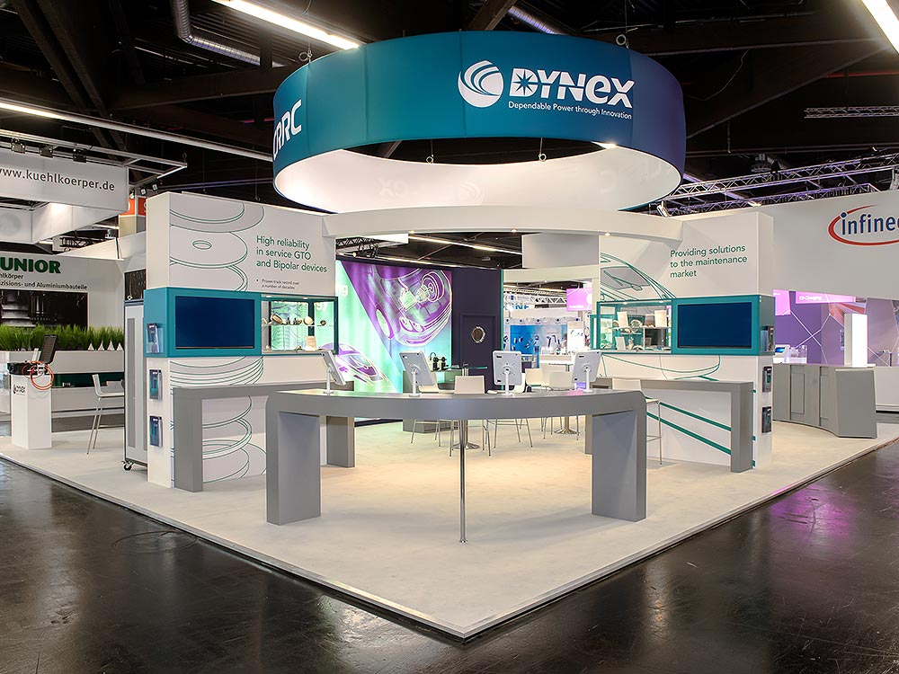
Standing out among a bunch of businesses is essential to attract the audience to an exhibition. However, it’s not an easy task to get all eyes on your business. One assured way to get the attention of the audience is through the strategic use of color psychology. Using compelling color according to color psychology is the key for the business as it helps in branding and creating positive experiences. Let’s find out how the correct usage of color psychology helps to create an exhibition stand design that lets your business stand out.
How the color psychology impact the audience?
Colors are a part of human life, affecting human emotions, behaviors, and perceptions. A different color evokes a different emotion ranging from romantic to fun and calmness and relaxation. Try to interpret what each color means. It will ultimately help you to attract the audience to the brand using the right color. Bespoke exhibition stand builders use the right choice of color can communicate their message to the audience, and foster positive relations with the audience. Let’s find out what each color means & how we can use them strategically to grab the attention of the audience.
1. Red: Attention-Grabbing & Energizing
Passion, vitality, and urgency are all the symbols of the red color. It may create a feeling of urgency, which makes it a great option for emphasizing discounts or promotions. Red must be used carefully though, as using it too much might be overpowering. It may be quite powerful to use red accents, either heavily or sparingly, to highlight important components of your display stand.
2. Blue: Trustworthy and Calming
Blue is frequently linked to dependability, professionalism, and trust. It can contribute to a feeling of stability and security and has a relaxing influence on the psyche. Using blue in the design of your exhibition stand might give visitors the impression that you are competent and trustworthy, which will encourage them to interact with your company more. Blue may be utilized as an accent or as the main hue to assist create a good first impression and interaction with potential clients.
3. Yellow: Optimistic and Energetic
The vivid and upbeat hue of yellow represents happiness, coziness, and optimism. It’s a fantastic option for companies trying to project an innovative and upbeat vibe because it’s frequently linked to energy and creativity. Yellow when used sparingly represents overpowering issues and even causes people to be cautious. Using yellow accents in your exhibition stand design may provide excitement and vitality to the space, making visitors’ experiences unique and captivating.
4. Green: Refreshing and Sustainable
Green is directly related to growth, sustainability, and the natural world. To make your business look ecologically sensitive and friendly, it provides a relaxing and revitalizing mental impact. When you want to represent your business as sustainable and environmentally responsible, adding a green color is the perfect solution. Adding green to your display stand helps establish your company as a socially and ecologically conscientious one. Whether it be through live plants, eco-friendly materials, or green accents, green is perfect to use.
5. Orange: Creative and Friendly
Bright and energizing, orange may inspire sentiments of inventiveness, excitement, and friendship. Innovation and approachability are the symbols of the orange. It’s a great option for businesses trying to stand out and leave a good impression. Orange elements may add enthusiasm and coziness to your show stand design, encouraging visitors to interact with your company. Orange may help create a lively and memorable exhibition stand that draws attention and encourages good interactions when people use it sparingly or as a prominent hue.
6. Pink: Femininity and Compassion
Pink is a color that exudes femininity, sensitivity, and warmth. Its soft and gentle hue creates an inviting atmosphere, appealing to those who appreciate compassion and empathy. Symbolizing love, affection, and playfulness, pink evokes a sense of romance and youthfulness. It is ideal for creating engaging and memorable exhibition stand designs. Whether used as accents or as the dominant color scheme, pink can infuse a sense of care and comfort into the space. From fostering positive interactions and leaving a lasting impression on visitors, pink does it all.
Conclusion
When you find out about color psychology and what each color interprets, you are likely to create appealing and exhibition stand designs. Whether you need the attention of your audience or want to convey your brand message, using the right color is the perfect option. If you want to set the right brand tone and want to leave a lasting impact on the spectator, get help from Wow Space Creative Exhibitions, a bespoke exhibition stand builder. We create exceptional exhibition stand designs that are used for customer engagement. We use the power of color psychology to help you stand out from the crowd in today’s competitive marketplace.


